By Annie MacHale
For as long as I can remember, I have been interested in patterns and colors. Some of my earliest memories are about noticing patterns on peoples’ clothing and taking “snapshots” in my mind of ones that I liked. Members of my family have learned that when I am looking at something in a certain way, I’m absorbing its color or pattern.

This pink band pattern mimics a clover's subtle color changes.
My theory is that all of my observations have lodged somewhere in my mind and come forth, in no particular order, in my weaving design work. For many years, I have used a spontaneous method for designing bands. I don’t start with a pattern on paper, but just sit with a pile of yarns at hand and create the pattern as I warp the loom. Guitar straps are my main woven product and I assure customers that no two are ever exactly alike.This is important to me—not to keep copying a design, but to make each a unique creation, a work of art in its own right. Every time I warp my loom, I’m creating a new color experiment. I’ve used anywhere from 1 to 22 colors in a single band, with 3 to 6 being most common.

Tins of shoe polish inspired the color combinations of this band.
While my color combinations are instinctive, I wanted to be able to explain to other weavers what I had proven to be true from my thousands of experiments on the inkle loom. Lacking formal art training, I launched into a delightful self-study course in color. In doing so, I learned the terminology for, and the explanations of, why things work the way they do. Still, I think of it as part science and part magic. To create a pleasing band design, you don’t have to study color theory, but it does pay off to observe the beauty around you and use it as inspiration.

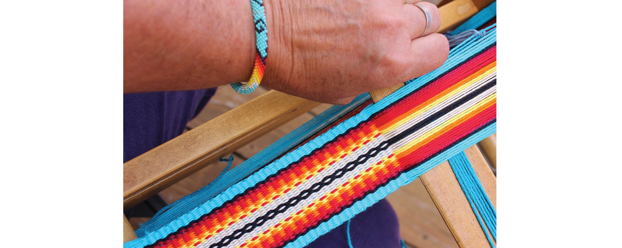
Colors and patterning on a Navajo bracelet led to this band design.
Choosing the right colors for a band is most important. The pattern allows the colors to interact, dictating the position and proportion of color. It’s no secret that I like designs that pop. My signature designs tend to include combinations of saturated colors, value contrasts, and gradations. The best designs have enough contrast that the pattern is attractive from a distance, and enough subtle aspects that they are also interesting from close up.
Like dots of paint on canvas used in pointillist paintings, small amounts of color next to each other in a warp will visually blend at a distance. I like to place one single thread-width stripe of a color next to another so that they blend visually. They create a different color altogether and offer the viewer a subtle surprise. As Laura Bryant says in her video A Fiber Artist’s Guide to Color, “You don’t get WOW from doing the expected!”
Find more color tips in Annie’s book
In Celebration of Plain Weave
for sale at https://www.etsy.com/shop/ASpinnerWeaver
Where to find Annie:
Blog: ASpinnerWeaver.com
Instagram: instagram.com/aspinnerweaver/
Facebook: facebook.com/ASpinnerWeaver/

