by Meagan Condon
Exploring Color Interaction Through Spinning with Neps
by Meagan Condon
As fiber artists, we thrive on playing with colors and textures. Josef Albers, one of the greatest color theorists of the 20th century, asserted that color is best studied through experience. What better way to experience the fickle nature of color than through experimental fiber arts? Using this sampling technique can help you choose and develop new color combinations for your projects!
In this tutorial, we will explore how a color can look completely different depending on what is next to it. When a color is placed against a contrasting background, it changes how we perceive that color. In this case, we will be placing small dots of one color onto a solid of a different color by incorporating neps into our fiber preparation.
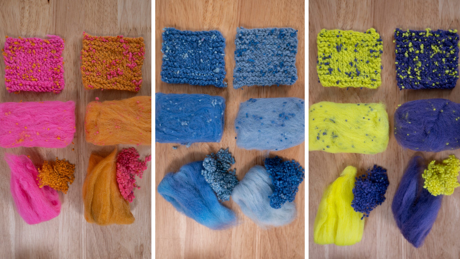
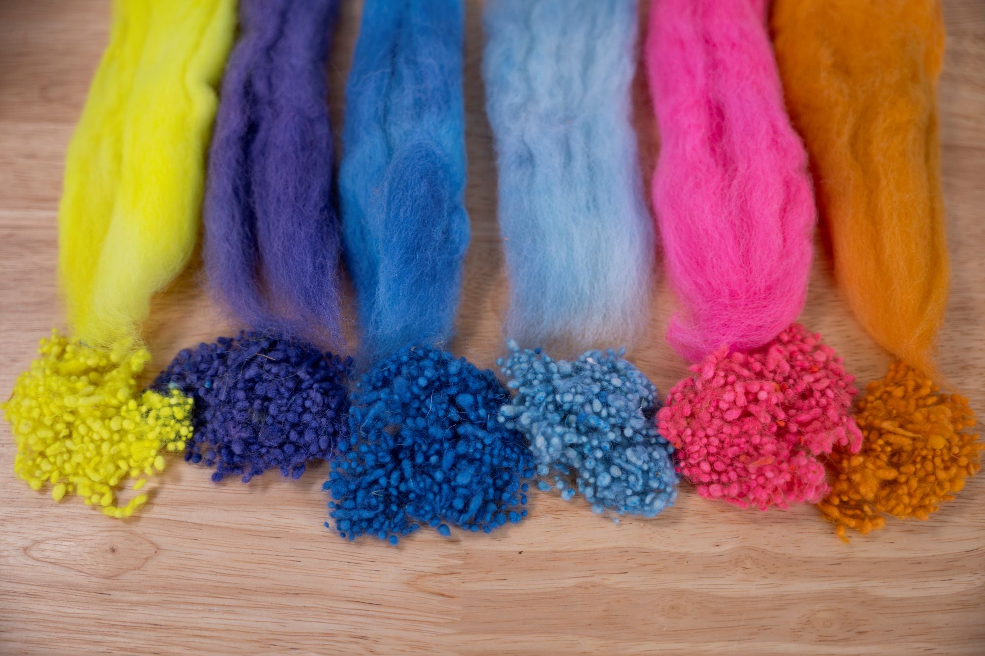
For my examples I used three color pairs — analogous (hot pink and orange), complementary (purple and yellow), and monochromatic (light and dark blue). I selected these very different types of color schemes to highlight how wildly different the optical illusion can appear when we pull from different areas on the color wheel.
You can choose whatever color combinations you would like to test. The ultimate goal of sampling in this way is to help you choose color combinations based on how colors interact.
What You'll Need
- 1/2 oz of dyed Corriedale or other medium wool (base fiber)
- 1/4 oz wool or cotton neps in a contrasting color (add-in)
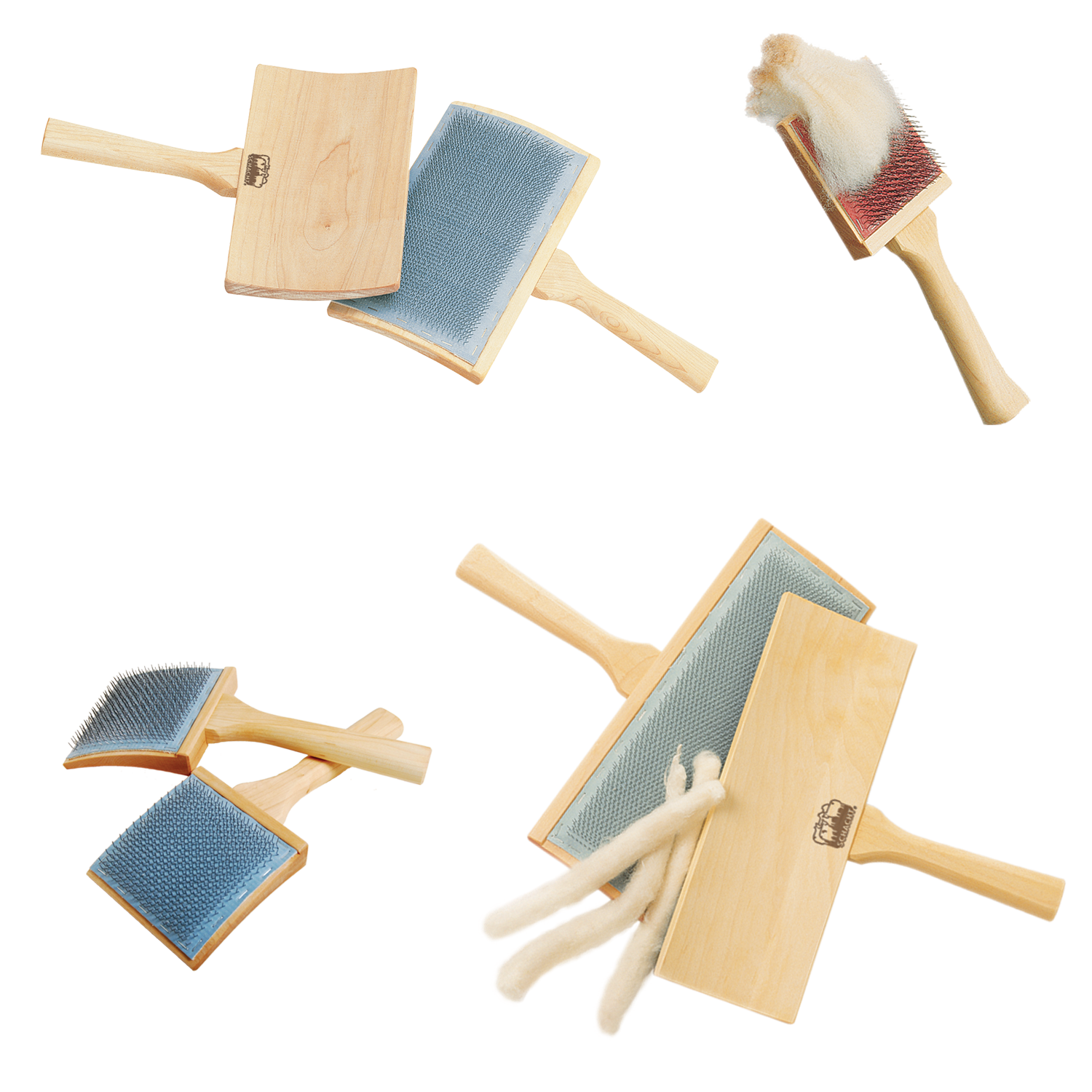
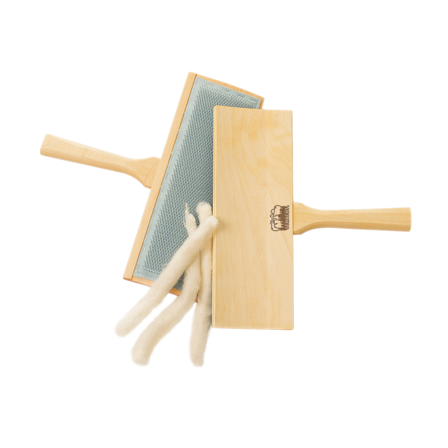
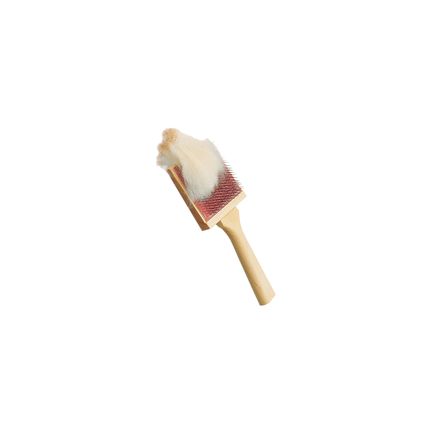
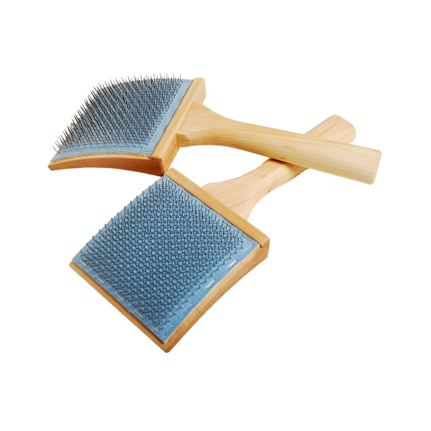
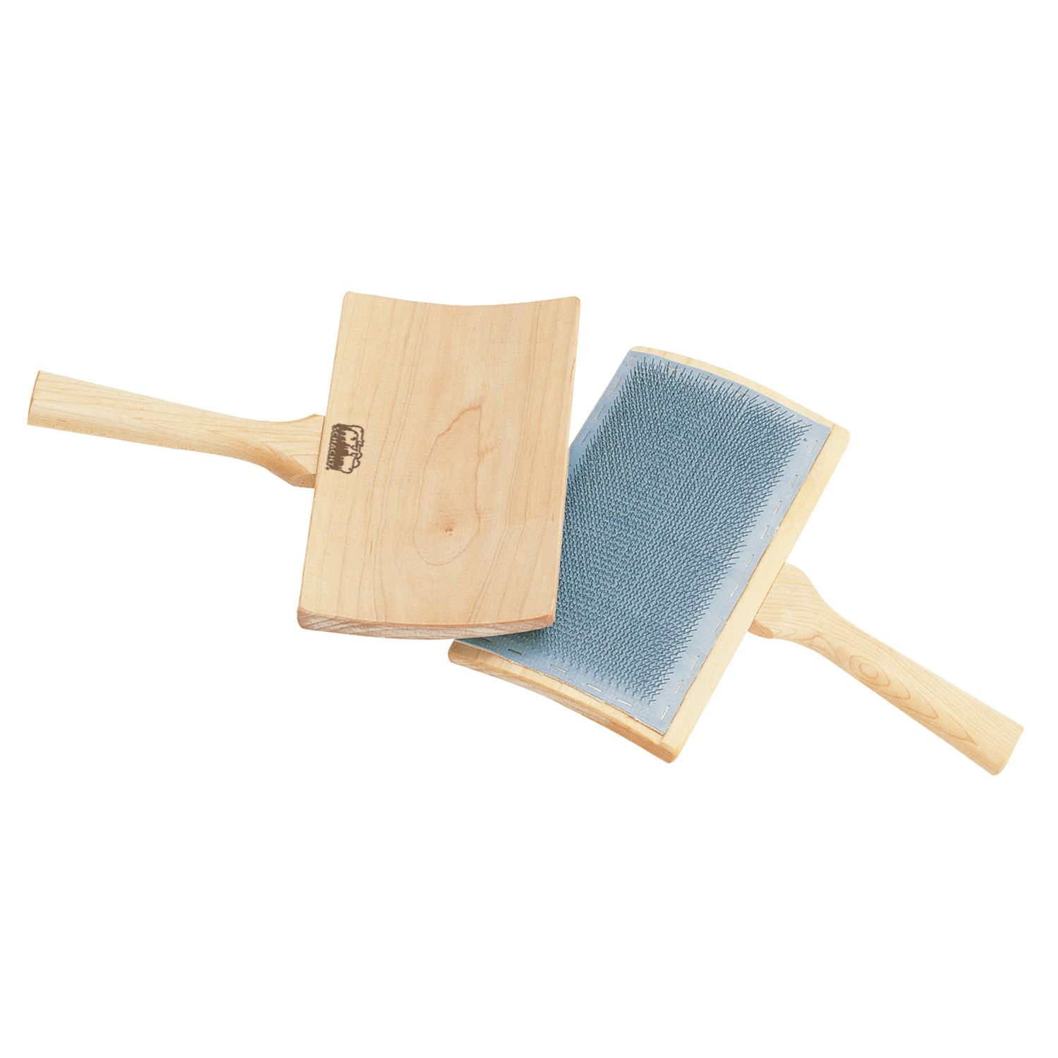
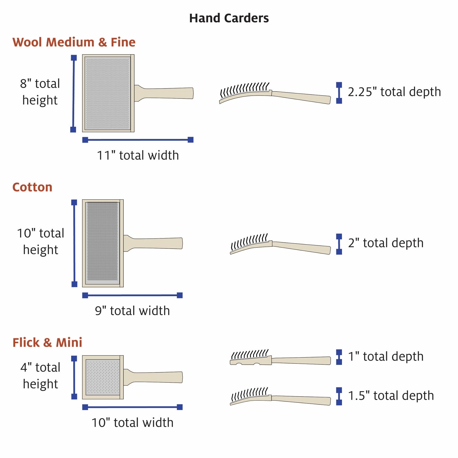
- medium wool carders
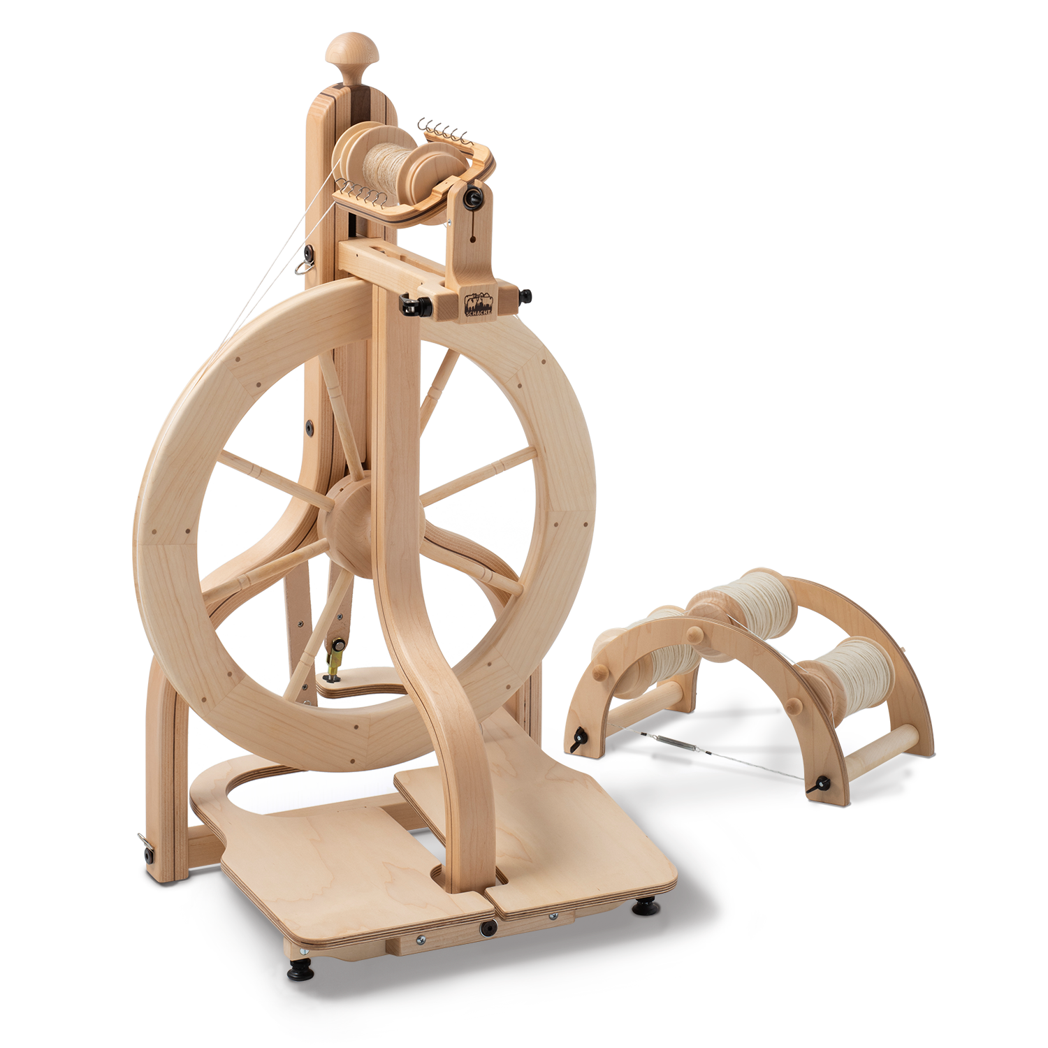
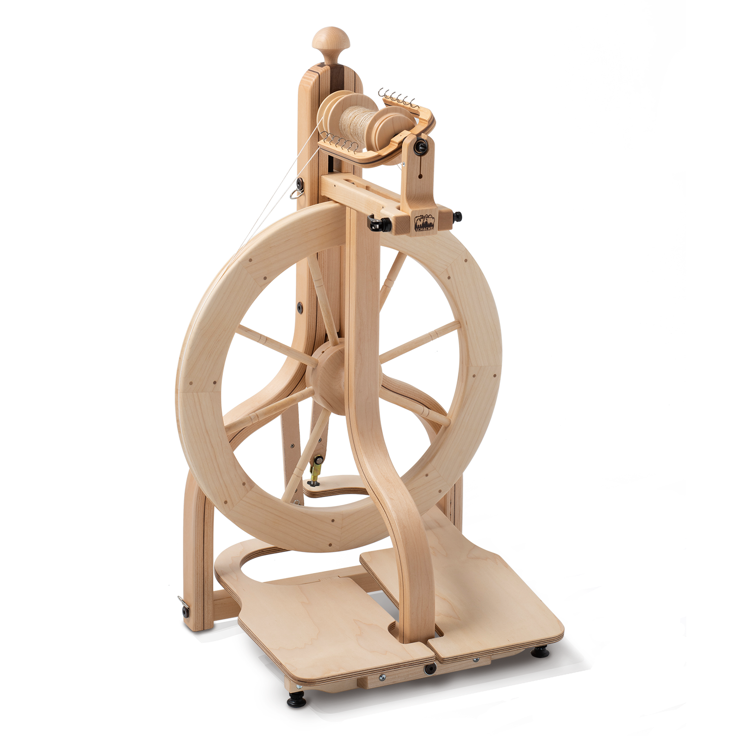
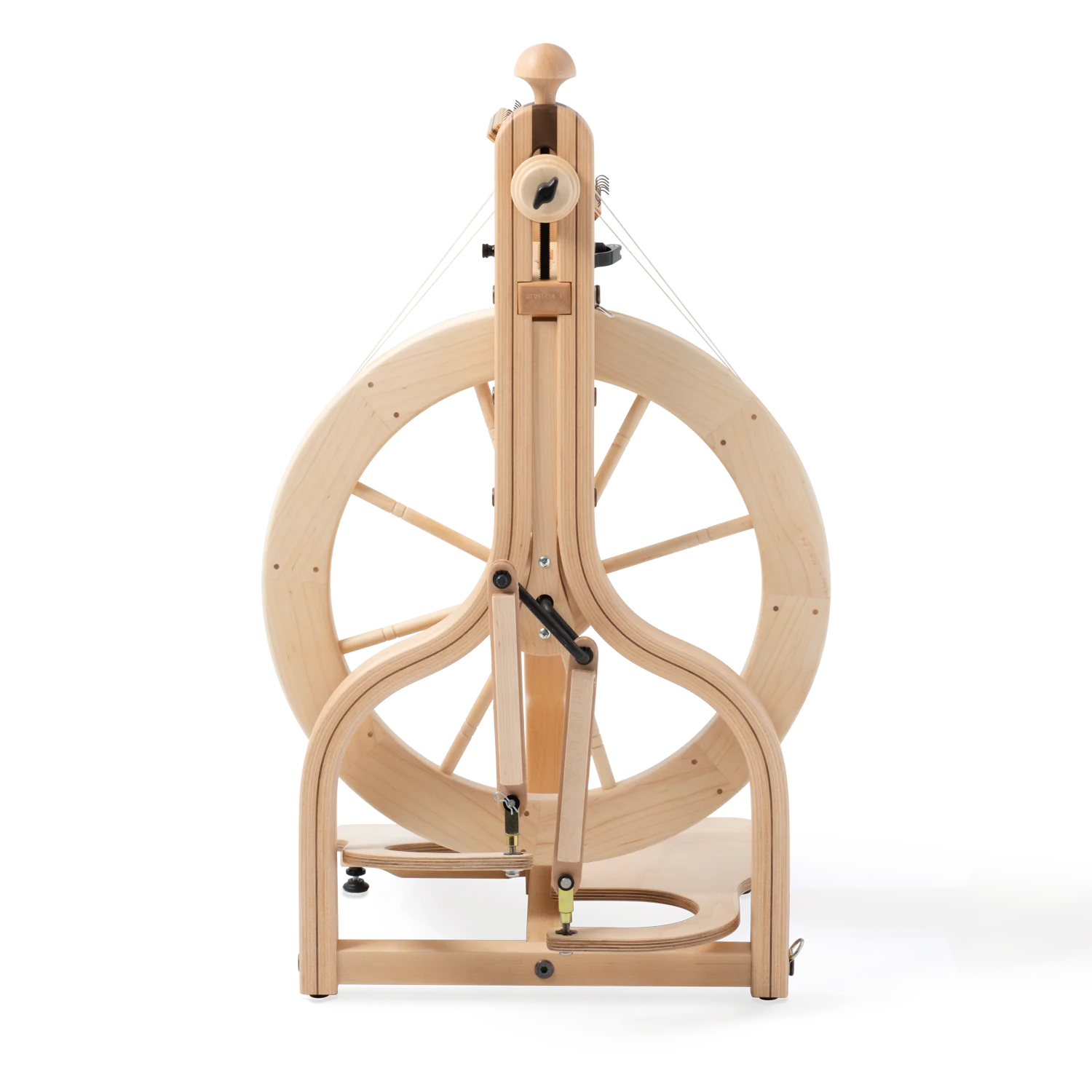
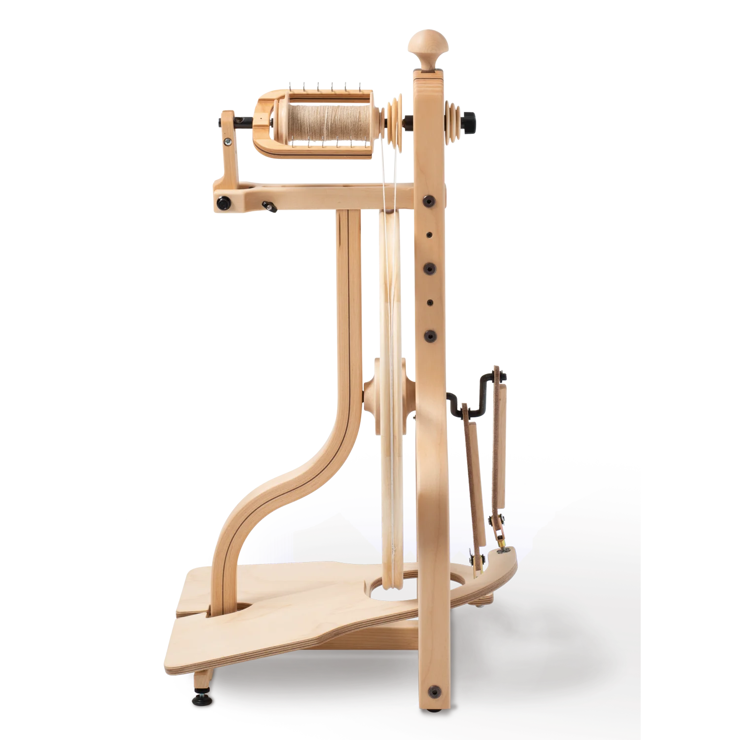
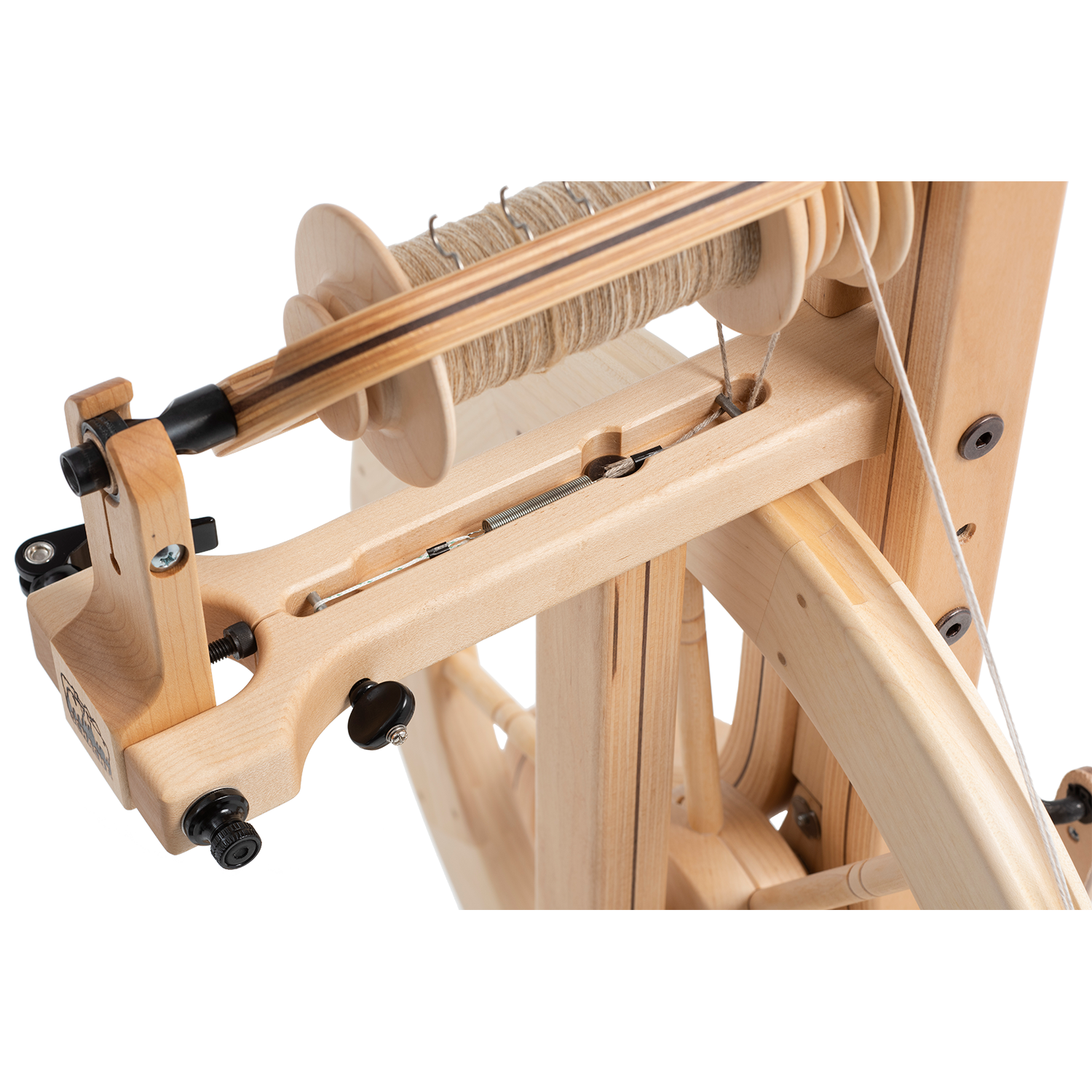
- Matchless spinning wheel
- knitting needles sized to the yarn you spun
- Zoom Loom (optional)
-
Wool wash
Materials - for each sample you'll need
Equipment
Notions
Directions
Fiber Preparation
- Begin by dressing the
carder with a thin layer of the base wool. This helps prevent the neps from
getting stuck.

- Spread and press a
generous amount of neps onto the surface of the carder. Aim for a blend of at
least 50% neps to wool, because several of these neps will likely fall out
during spinning and knitting.

- Add another thin layer of wool on top, creating a fiber sandwich with the neps in the center.
- With 2-3 passes, card
the fiber until the neps are well-incorporated into the batt. The base fiber
should easily hold the neps in place.

- Lift the carded batt off the carders or roll it into a loose rolag, whichever preparation is more comfortable for you to work with.
Spinning with Neps
- Spin singles with the
freshly carded batt (we will end with a 2-ply yarn). Neps can fall out of the
yarn as you are spinning, but there are a few tricks to making this process
easier. We want to make sure they are anchored in the yarn. When you get to a
nep, make sure that it is in the center of the draft zone, not on the outside.
Do this by folding the base fiber over the nep or by layering a few wisps of
base fiber over the nep. As you apply twist, the base fiber cyclones around the
nep and acts like a net that traps it in place. Ensure that you add enough
twist to your singles that the tiny fiber nets don’t completely untwist and
allow your neps to fall out during plying.

- Ply two singles to
create the 2-ply yarn.

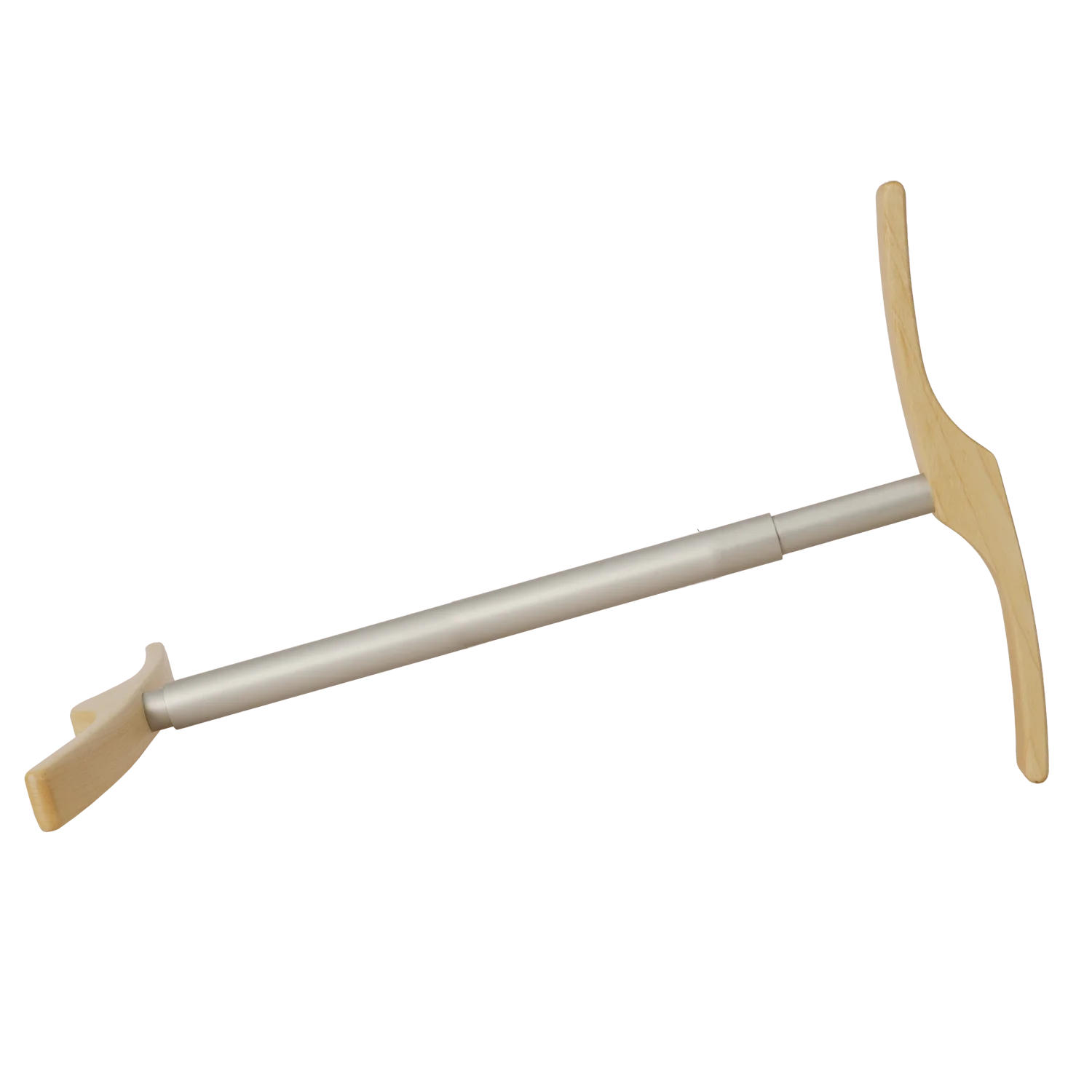
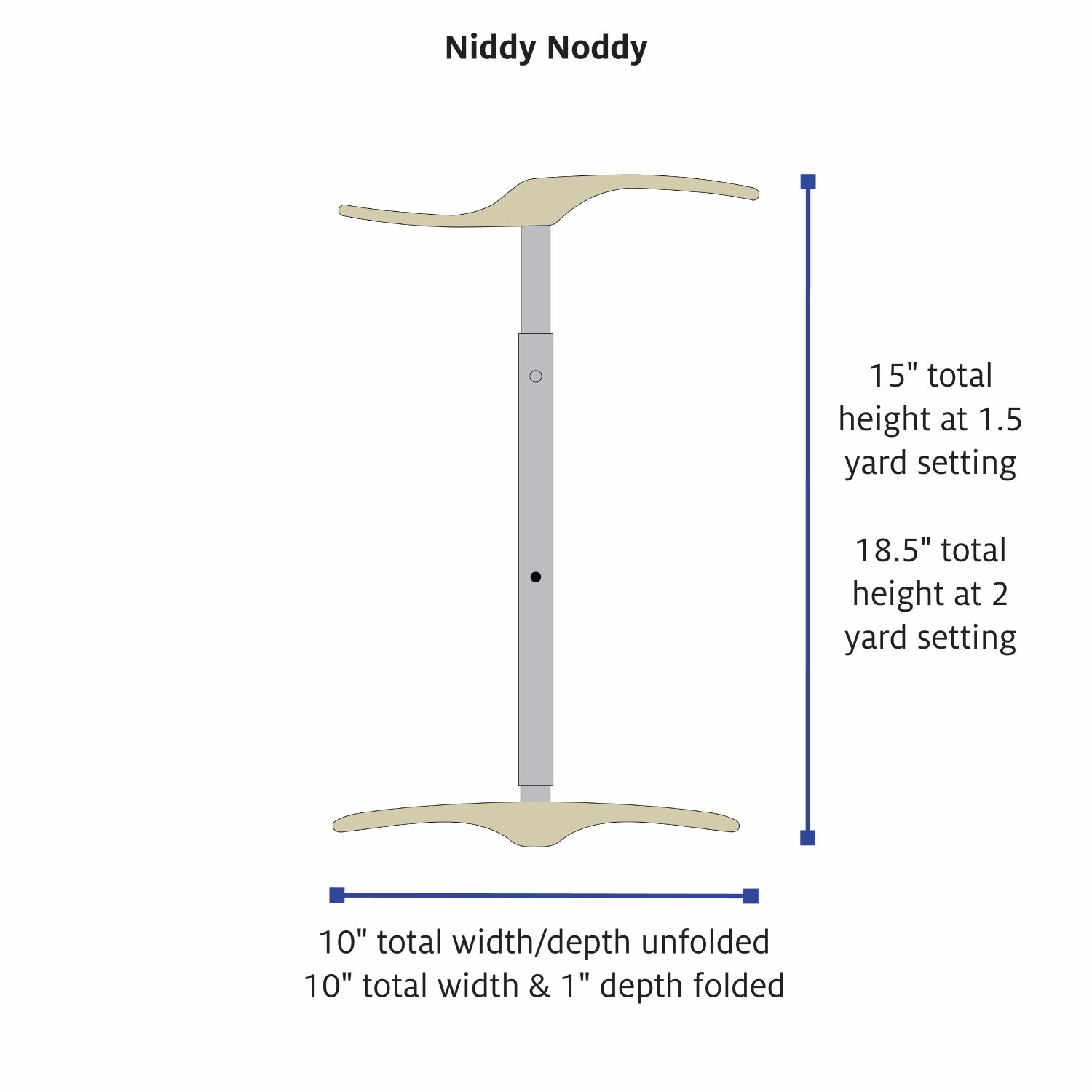
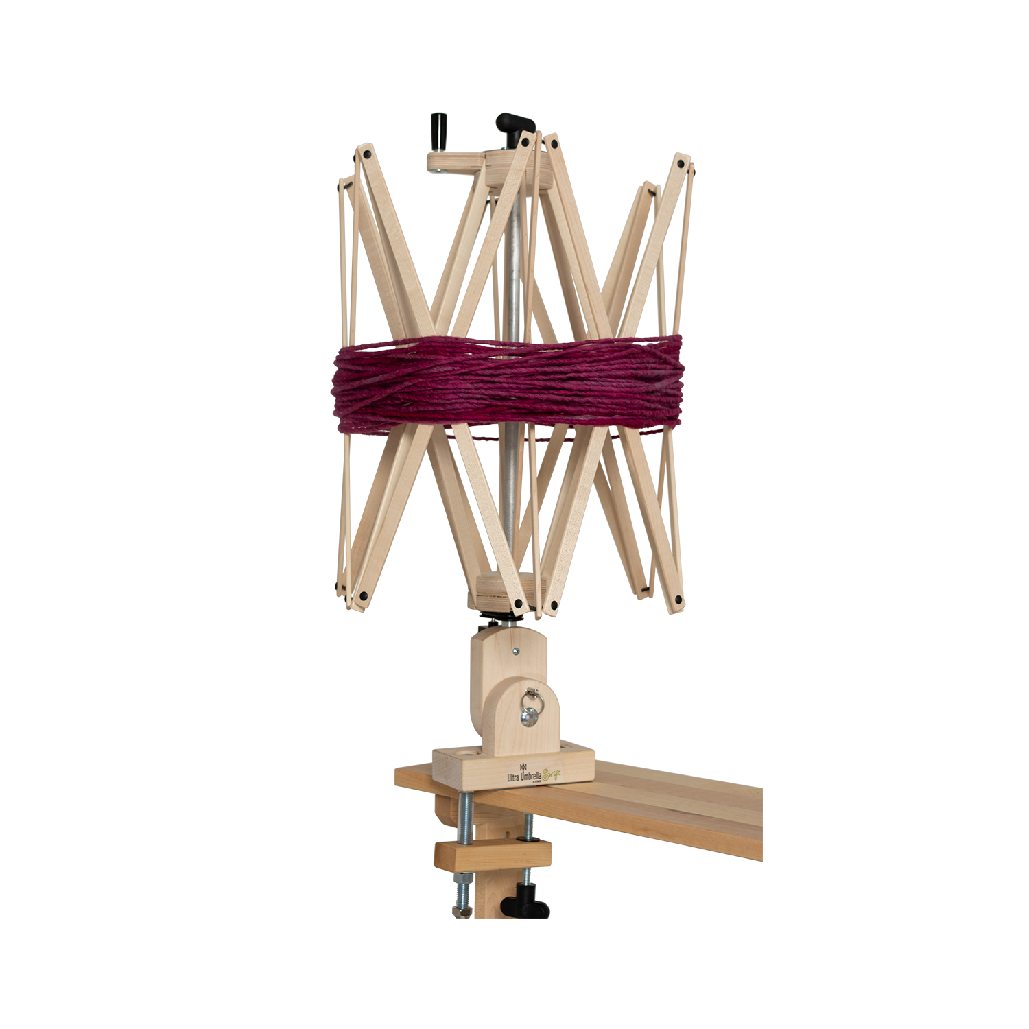
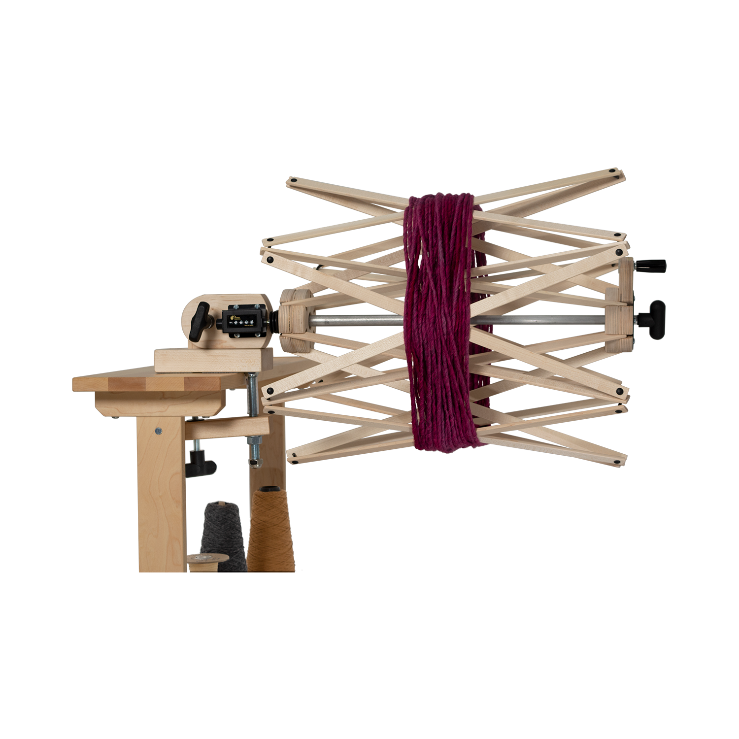
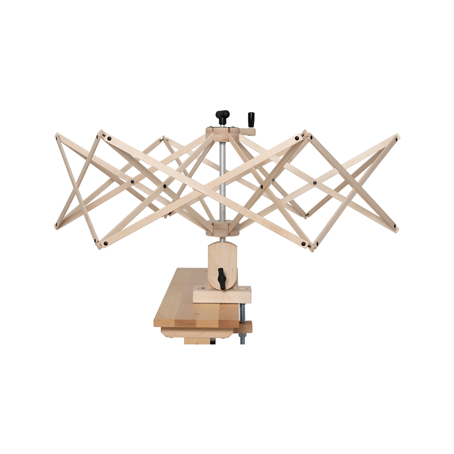
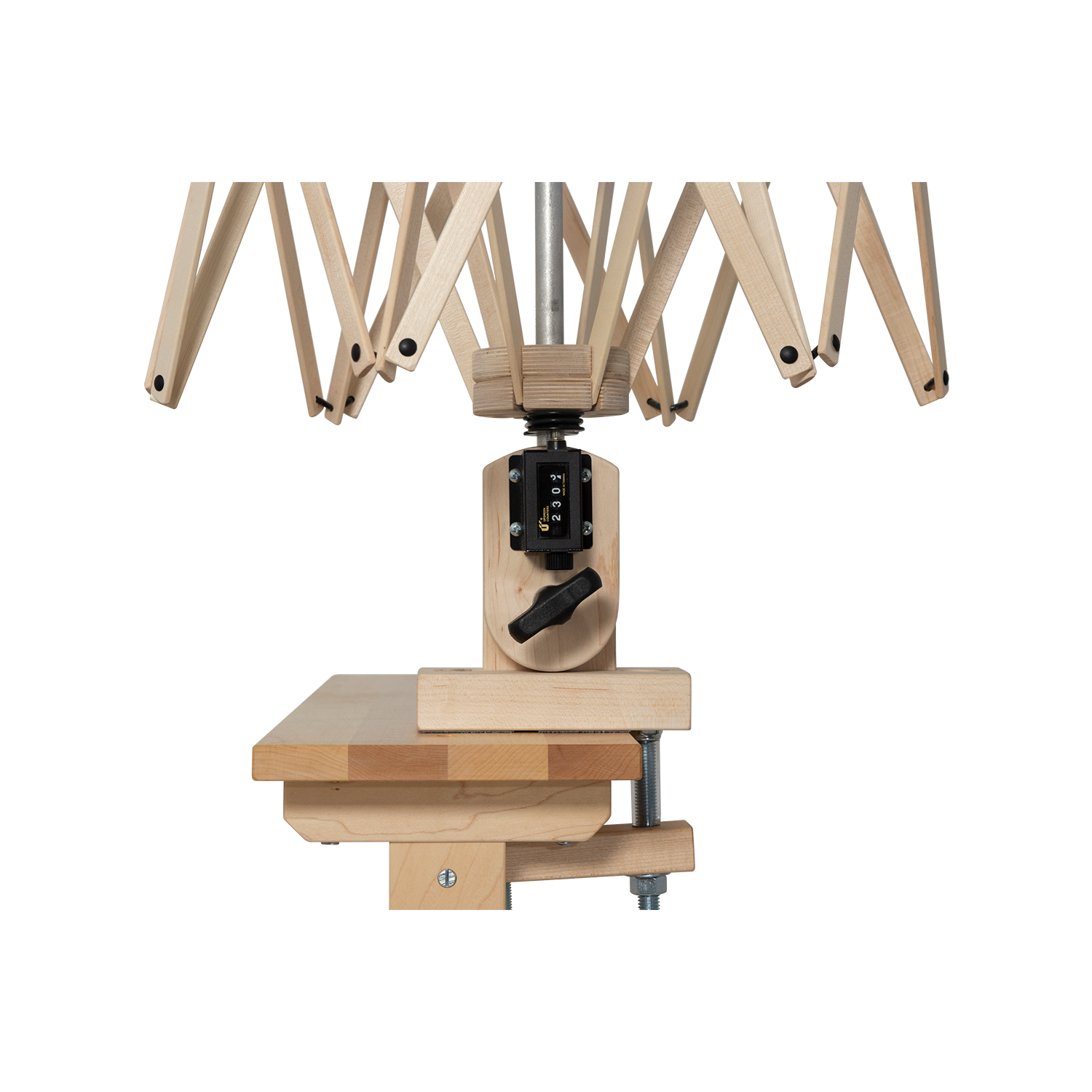
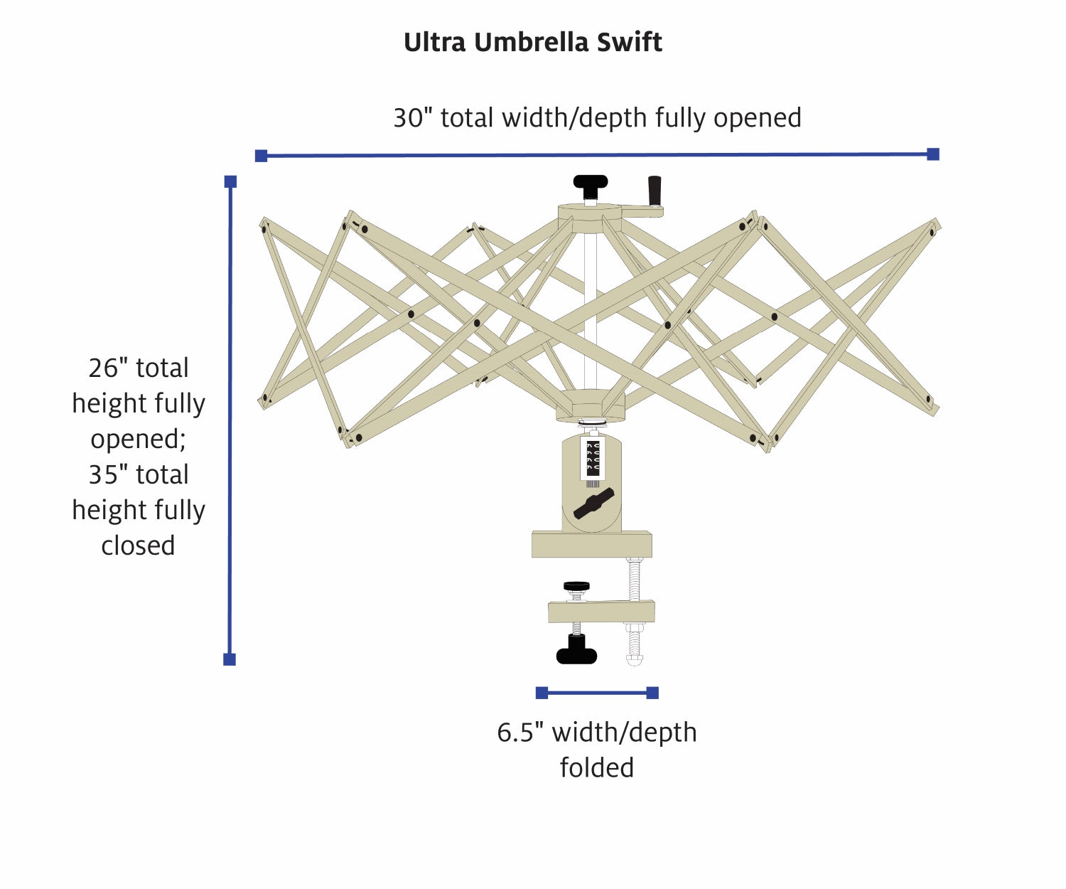
- Wind the yarn onto a niddy noddy or swift to create a skein.
Finishing
- Soak the yarn in hot water. Use wool wash as desired.
- Apply mild agitation, rubbing the yarn gently with your hands. At this point, any neps that are not well anchored will fall out of the yarn. The agitation will provide fulling or a mild felting that will help the neps stay firmly anchored in the yarn.
- Allow the yarn skein to fully dry without any weight added to it.
Sampling and Color Comparison
- Knit, crochet, or weave a 4" sample swatch using your preferred method.
- Compare! How does the
color of the neps look against the background color?

Notes
What can we learn from these samples?
In the examples shown, you’ll notice that the purple neps on the yellow background look less saturated than the purple base fiber, even though the two are the same color. The yellow neps, which are close to a pure yellow, visually pop more against the purple.
The light blue neps appear even lighter in color when viewed against the dark blue background. However, the dark blue neps also look lighter than the dark blue base fiber. They do not visually pop in the way the yellow neps do, creating an almost opposite effect.
Finally, the orange neps on the pink background appear more yellow than the orange base fiber. The pink neps appear to lean more toward a warmer pink than than pink base fiber. Again, all of these colors were dyed to match, so there is no true difference between the pink neps and pink base fiber or the purple neps and base fiber. But our eyes read them as slightly different colors!
Why Does This Happen?
The back of your eye is lined with light- and color-sensitive cone cells. The cones can interact in complex ways which can fool your eye. For example, when cones in one part of your eye see blue light, they make nearby cones less sensitive to blue. Therefore, if you see a light blue dot on a dark blue background, the dot will appear less blue than it otherwise would. Likewise, an orange dot against a hot pink background will make the background appear less pink, leaning more toward the yellow than would look as a solid color. In the case of our purple and yellow, our yellow is a primary color which lacks blue and red pigment. That blue and red is contained within the purple, on the opposite side of the color wheel. Because there is no overlap in the colors in a complementary color scheme, our eyes view these colors as high contrast, unlike our other samples.
Apply This Concept
The next time you spin for a sweater or another large project, consider sampling in this way as you explore colors for your project. While we used neps in this tutorial to create our color shifts, try using a speckle-dyed roving or a smooth batt with different colors incorporated. Recycled sari silk or other add-ins can also create this color-shifting illusion. A color that looks too bright to you can be neutralized by pairing it with the right color. Or if bright colors are your happy place, choosing the right pairing can make your colors pop more! Our eyes lie to us all the time. Let’s use that to our advantage!
Resources
Albers, J., & Weber, N. F. Interaction of Color. Yale University Press, 2013.
Gurney, J. Color and Light: A Guide for the Realist Painter. Andrews McMeel Publishing, 2010.

